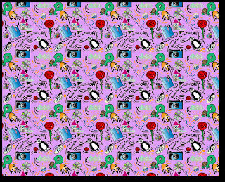
TASK:to create a wallpaper which shows things that relate or represent me.
 Effects can be bold and bubbly : individual elements.
Open illustrator:
Create new file: web - largest page
Name: wallpaper elements
Include warp tool
Object envelope distort > expand
Copy paste shrink.
How to make a symbol " symbol pallet : Tool includes a library of vector symbols.
MAKE: select the object select the new symbol option give a name delete original and insert created symbol.
Can now be re-sized without things changing.
Library of symbols.
Delete and create own.
Illustrator
Symbols and creating via dragging
If creating and have preset symbols delete.
Pallets should only have your OWN symbols
Select all and then click palate icon save symbols user defined Charlotte's symbols.
STEP TWO > Creating the tile for wallpaper.
Once you have pallets
File new doc Web 300*300 = Square
Build up wallpaper
Populate tile with different symbols
Repeating patterns = uniformed grid
If is off the art board.
Object - transform - move "window"
Move 300* horizontal or vertical.
Copy. For corners same process for all.
Neg = down left
Pos = up right
Save for web PNG24
Clip to art board
OPEN TILE IN PHOTOSHOP
select all cmdA - edit define pattern
NEW DOC - web - 1280 * 1024
Bucket tool - pattern - tiled pattern > Then simply change the background of your tile to create the final effect then upload to Flick R.
3 Things i liked about my wallpaper:
1. I liked the way that I've joined different symbols together e.g the Penguin & the rose an the iceberg.
2. The way the symbols all relate together give the effect of something really abstract, but mainly its how it catches the eye like the Camera draws me in more than anything else due to the defined edge it gives off.
3.I like the way that the symbols intertwine more due to the added lines and shapes.
3 things i could improve about my wallpaper:
1. The camera could've been put in a different angle because it shows that it's been tiled repetitively.
2.Looking at it now i would chose a different background colour due to the fact some of the symbols are rather light so therefore don't show up with great effect.
3. I could've made the symbols more bold and stronger around the edges.
No comments:
Post a Comment