Wednesday, 23 October 2013

Colour Correction on Premiere Pro


In media today we looked at different things within colour correction on Abobe PremierePro.


RGB - screen and tv use this to generate colours that are seen on tvs. Theses can be used in premier to edit the look of colour.
LUMINANCE - lights and darksCHROMINANCE - strength of the colour. 
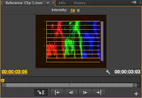
On premier go to workspace - colour correction. This should open up new workspaces with intensity and chroma.
Click on Yc waveform selection - will generate a sound vibe window.


This is a display of luminance and chrominance.
Has a scale on the side 1.0 means that it's pure white and 0.0 is pure black.
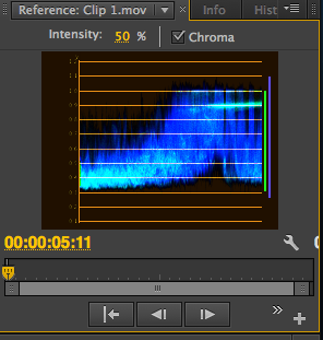

Broadcast safe - example can be a tie with jazzy patterns that comes across to vibrant on screens. 
With the Yc waveform it allows us to see thing that may need correction within colour because some formats may not accept this.
YC Waveform-
Displays a waveform monitor for viewing luminance and chrominance information.
Setup (7.5 IRE)
 
Displays a waveform that approximates the final analog video output signal. Deselecting this option displays the digital video information.

Chroma
 
Displays both chrominance in addition to luminance information. Deselecting this option displays only the luminance.

The Vectorscope has the following controls:
Intensity
Adjusts the brightness of the pattern display. It does not affect the video output signal.
75%
 
Default position. Use to check video input in which standard 75% intensity bars, like those in Premiere Pro, are used.
100% Shows the entire range of video signal chrominance. Use with video input containing 100% intensity bars. 
e.g. red being to red this may be that the chrominance level needs to be lowered.


RGB PARADE
Shows the levels within the image or clip and shows the balance.
The Intensity control adjusts the brightness of the waveforms. It doesn’t affect the video output signal.
We can change around with the colour settings in this- 
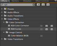
how do we do this? Video effects
Effects - search - RGB curves drag to video 

Tuesday, 15 October 2013

BMIA DDAY


On Thursday 11th October, out media class took part in a workshop with the company Mobas.

Mobas is a company of whom are a agency that have 4 expert areas in
  • Branding
  • Design
  • Strategy 
  • PR
They're in the top 100 for advertising and have partnerships with many worldwide brands. they're thoroughly helpful when it comes to helping with advertising by helping create social media campaigns and giving the advise which people need to make their companies more aware to the public eye.

We were told about how social media it very effective, and the reasons which i learnt from them were that its good because it made things more cost effective, give people a richer experience, is something thats interactive to everyone and was easily measurable.

Key advice which we were given for our task was that we needed to
  • have objectives
  • goals and targets
  • to listen to what others wanted
  • to engage with people
  • to promote
after being given a presentation we were but into groups of 7 via the teachers.
We were given the task of which was to create our own fashion shop within cambridge.
In our groups we discussed and talked about what we should use to promote and create our shop.

I decided that i would take the time to create a webpage for our chosen shop called Jazzy-Ret.

 The picture on the side here shows the font and the layout of the homepage of the website i chose to make. The font i chose was lobster, and i chose it because i felt that it strongly linked with the Natural theme that we had chosen and it gave a great contrast with the green heading colour.

I set up 3 different pages on the site so it was a replica template of which a website would be looking like if it were real. I chose to make an about us page which was to promote who we were and what we did as a clothing line and the special offers of which we did on a day to day basis ect.
 

Along side this we also made flyers to promote a student discount which was to engages with customers of a younger age and generation,  also we made a facebook and twitter page to give the effect of a great brand who stays in effective communication with customers ect.

I feel that this day was a great step in learning to me because this is something that has really interested me in life and its actually given me more choices of which i can do in the future now as i've been given more information on the advertisement front of media and also how promoting can change things.


Sunday, 6 October 2013

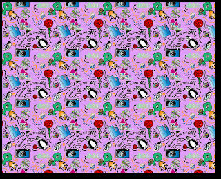
Creating a wallpaper.

TASK:to create a wallpaper which shows things that relate or represent me.

Effects can be bold and bubbly : individual elements.

Open illustrator:
Create new file: web - largest page
Name: wallpaper elements
Include warp tool
Object envelope distort > expand

Copy paste shrink.
How to make a symbol " symbol pallet : Tool includes a library of vector symbols.
MAKE: select the object select the new symbol option give a name delete original and insert created symbol.
Can now be re-sized without things changing.

Library of symbols.
Delete and create own.

Illustrator
Symbols and creating via dragging
If creating and have preset symbols delete.
Pallets should only have your OWN symbols
Select all and then click palate icon save symbols user defined Charlotte's symbols.


STEP TWO > Creating the tile for wallpaper.
Once you have pallets
File new doc Web 300*300  = Square
Build up wallpaper
Populate tile with different symbols
Repeating patterns = uniformed grid
If is off the art board.
Object - transform - move  "window"
Move 300* horizontal or vertical.
Copy. For corners same process for all.
Neg = down left
Pos = up right

Save for web PNG24
Clip to art board 
OPEN TILE IN PHOTOSHOP
select all cmdA - edit define pattern
NEW DOC - web - 1280 * 1024
Bucket tool - pattern - tiled pattern > Then simply change the background of your tile to create the final effect then upload to Flick R.


3 Things i liked about my wallpaper:
1. I liked the way that I've joined different symbols together e.g the Penguin & the rose an the iceberg.
2. The way the symbols all relate together give the effect of something really abstract, but mainly its how it catches the eye like the Camera draws me in more than anything else due to the defined edge it gives off.
3.I like the way that the symbols intertwine more due to the added lines and shapes.

3 things i could improve about my wallpaper:

1. The camera could've been put in a different angle be
cause it shows that it's been tiled repetitively.
2.Looking at it now i would chose a different background colour due to the fact some of the symbols are rather light so therefore don't show up with great effect.
3. I could've made the symbols more bold and stronger around the edges.

Thursday, 3 October 2013

Favourite Media Work


Within the Media diploma so far, i would say that the first week of our project would be using Adobe Photoshop CS6 to generate the layered cartoon character composite images.

Following the tasks given I have chosen this as my favourite piece of work by far due to the fact that I thoroughly enjoyed doing this via the Wacom tablets and learning along side this.


Examples in this period would've been learning how to edit and redefine a photo; we did this by opening up a photo on CS6 via the file option or either drop and dragging a photo into the program.